The Brief: Chanel Coco Beach 2026
How a black sand beach turned a resort campaign into a graphic exercise

Welcome to The Brief, a series in which I reverse-engineer the creative thinking behind a well-known campaign or editorial, what the brand was trying to solve, what decisions were made, and what the image tells us about how art direction works in practice.
*all of this is based on assumption and interpretation, I was not part of the process of the original campaign.
Brand: Chanel Campaign: Coco Beach 2026 Creative Direction: Sheila Single Photography: Julien Martinez LeclercHair: Lukas Tralmer Makeup: Christelle Cocquet Models: Anatol Modzelewski, Elodie Guipaud, Rebecca Leigh Longendyke, Sun Mizrahi
What the brand was solving. This is Matthieu Blazy’s first Coco Beach collection for Chanel: resort beachwear, historically one of the house’s lightest, most commercial categories. The problem is simple: beachwear campaigns default to white sand, blue water, golden light. That visual language is warm and aspirational but it belongs to every brand. It says holiday. It says relaxation. It says nothing about Chanel specifically. Under Virginie Viard, who departed as artistic director in June 2024, Coco Beach lived in that register — pastel, breezy, approachable. Blazy’s team needed the campaign to mark a visual break while still selling swimwear and sandals.
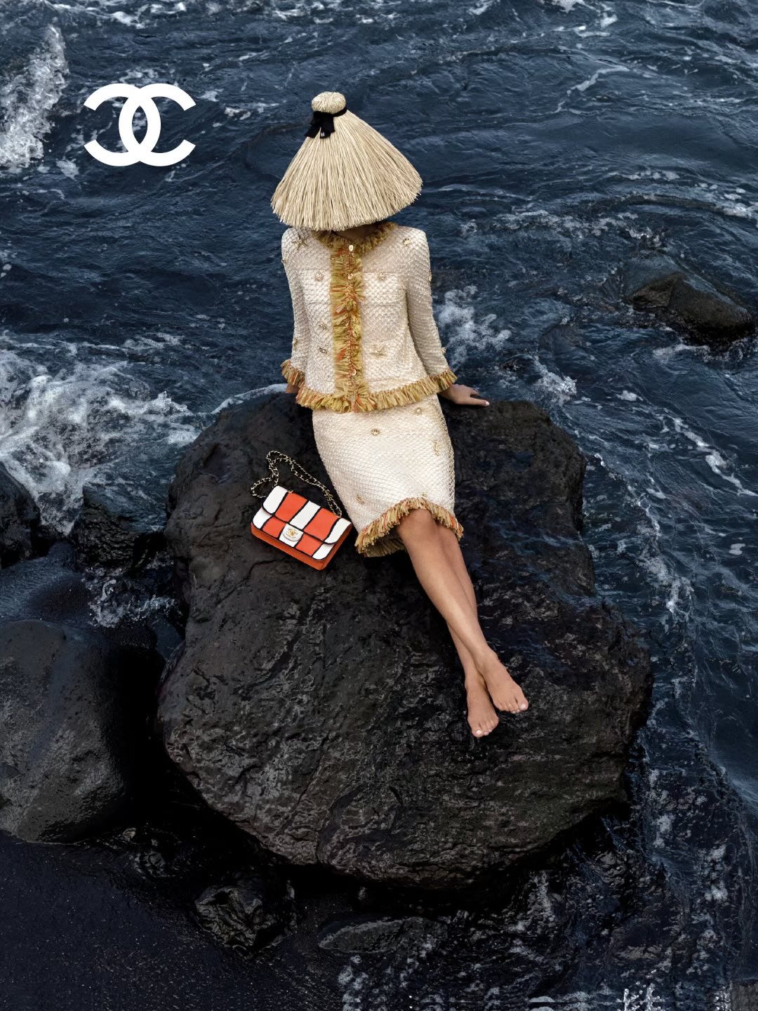
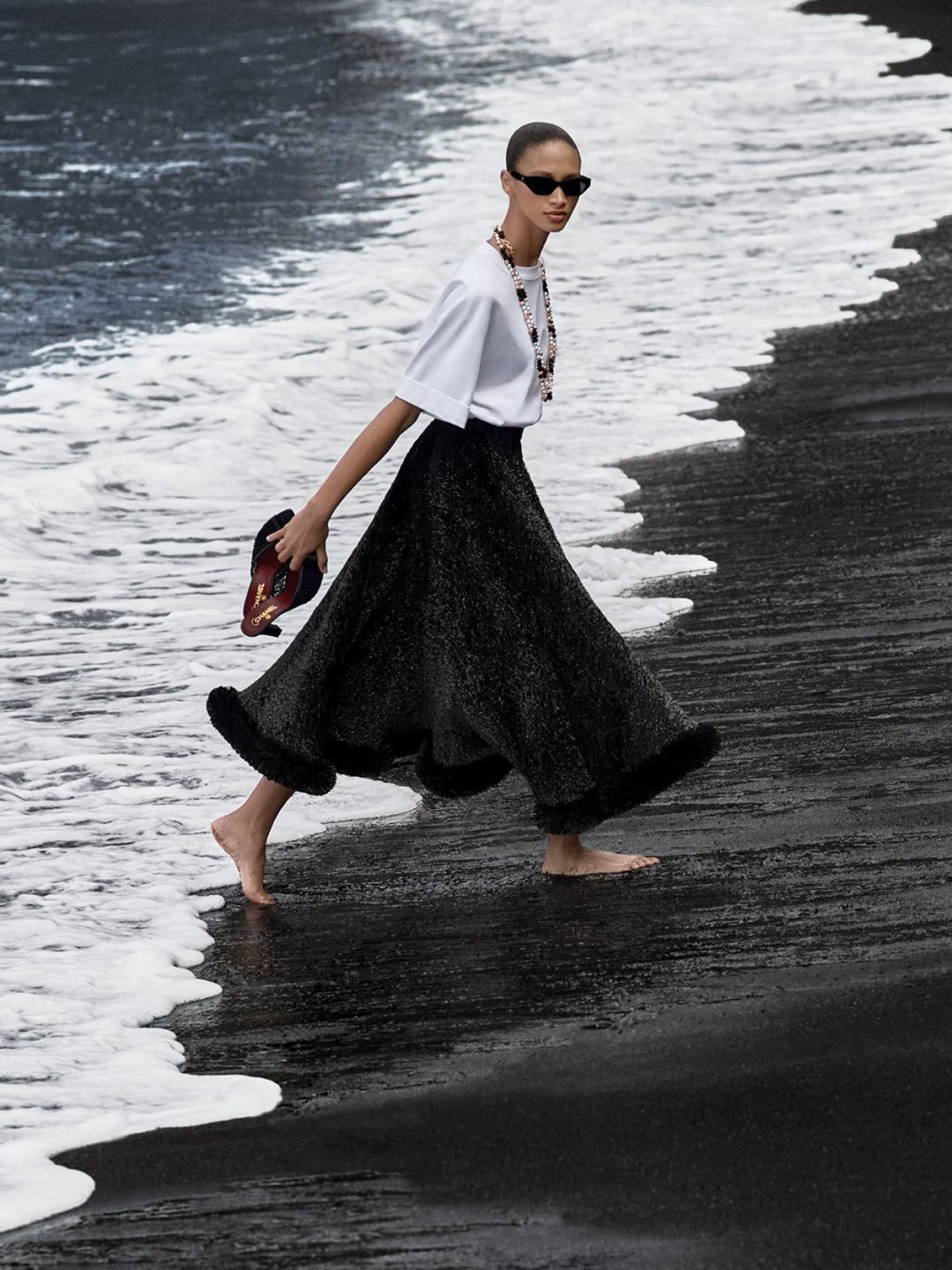
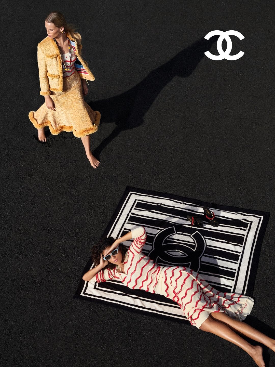
The location and what it does. The entire campaign is shot on black volcanic sand, and this single choice is what makes every other element in the images work harder. Black sand functions as a near-studio backdrop in an outdoor setting: it absorbs ambient light, eliminates visual noise, and turns anything placed on it into a graphic object with clean edges. A woven tote in green, yellow, and blue becomes a colour field study. A gold chain necklace with crab-shaped brooches reads with the precision of jewellery on black velvet. A printed cotton skirt fanned out around a reclining model becomes a circular composition against a flat dark ground. The psychological effect on the viewer is immediate — the eye has nowhere else to go. There is no horizon line competing for attention, no palm trees suggesting a generic tropical location, no blue sky pulling the image toward lifestyle advertising. The product and the body are isolated against darkness, which gives them the visual authority of an object in a vitrine. This is how you make beachwear feel like mainline Chanel: you take away the beach-holiday signifiers and replace them with the visual grammar of a still-life campaign.


The overhead angle and what it does. Several images are shot from directly above, looking down at models lying flat on the sand with garments and accessories arranged around them. This is a flat-lay composition applied to the human body, which is a technique borrowed from product photography and e-commerce rather than from fashion portraiture. The effect is twofold: it equalises the body and the product (the model, the bag, the shoes all sit on the same plane with the same visual weight), and it removes perspective, depth, and horizon, which makes the image feel more like a graphic poster than a photograph of a moment. For the viewer scrolling through Instagram, where this campaign will do most of its work, a flat overhead composition on black ground stops the thumb faster than a conventional beach scene because it reads as designed rather than as captured. It signals intention. It signals control. Those are brand values.
The colour and what it does. The collection itself is vivid with tropical prints, primary-colour striped bags, pink-and-white lace, bright raffia and against the black sand, every colour in the campaign reads at maximum saturation. This is a basic principle of colour perception (Josef Albers wrote the book on it): a colour appears more intense against a dark neutral ground than against a light or competing one. The art direction uses this to solve a specific commercial problem: how do you make printed cotton beachwear and canvas totes feel as desirable as a leather handbag? You give them the same visual treatment, isolate them against black, light them evenly, let the colour do the selling. The viewer registers luxury because the presentation language is luxury, even when the product category is casual. That gap between the casual product and the elevated presentation is where the desire gets produced.


What it conveys. The reverse-engineered brief reads: make Coco Beach feel like Chanel, make every product look like the hero, and signal a new creative direction. The black sand answers all three and it does so by understanding that the strongest art direction decisions are often subtractive. The campaign works because of everything it removed: the white sand, the blue sky, the golden light, the lifestyle context. What remains is colour, form, and surface, the elements that Blazy’s Chanel appears determined to be defined by. You still have to keep in mind that this is one of the most commercial campaigns of the year from Chanel (besides beauty and perfume) and in this case it looks quite interesting within all the restrictions.